Brand Guidelines
This page exists as a reference for the proper use of the following branding assets. We appreciate your cooperation with our brand guidelines.
If you will be downloading these assets for use, please follow this flowchart for proper approval processes.
Box Logo
Why Do We Use A Compass?
We start the conversation and help people find their individual path.
Safe Space
The logo requires a boarder of that is free of imagery and text surrounding it. Use half the Icon’s height to determine the minimum amount of safe space that should surround the logo. If copy appears below the logo, you should measure safe space of 30 pixels from the bottom of the logo to the beginning of the text. The logo must always be in the middle at the bottom of the page or middle top of the page.
Sizing
To maintain the visibility of the compass the Logo should maintain the size of one fifth its material whenever possible. Please use the following guidelines for standard use.
Maximum
H 31.946 pt x W 122.4 pt
H 2p7.946 x W 10p2.4
Minimum
H 29.1416 pt x W 111.6547 pt
H 2p5.1416 x W 9p3.6547
Social Media
Maximum
H 60pt x W 230.03pt
H 5p0 x W 19p2.03
Minimum
H 41.1932 pt x W 153.2891 pt
H 3p5.1932 x W 12p9.2891
What Not To Do with the Logo
Here are a few examples of what not to do with the logo.
Separate The Compass and logotype or replace it with other shapes or icons.
Rotate or disproportionately stretch the logo.
Invert logo or remove the box around symbol.
Make symbol larger than logotype.
Remove logotype from logo box or choose a new shape.
Outline logo or add a stroke to box.
Add a pattern or image.
Use colors other than black or white.


Compass Logo
The Compass Logo is a flexible mark that works as a call to action and a larger version of our Box Logo. If you don’t have enough room to use the Stamp with the correct amount of safe space, you should use the Box Logo instead.
Safe Space
The Stamp requires a boarder of that is free of imagery and text surrounding it. You should measure safe space of 30 pixels to determine the amount of safe space that should surround the Logo. Use one fourth of the logos height to determine the minimum amount of safe space from the bottom of the logo to the beginning of the text. The logo must always be in the middle at the bottom of the page or middle top of the page.
Sizing
To maintain the visibility of the compass, the logo should maintain the size of one fifth of its material whenever possible. Please use the following guidelines for standard use.
Maximum
H 122.4 x W 122.4 pt
H 12p6 x W 3p3.15
Minimum
H 61.2 pt x W 61.2 pt
H 5p1.2 x W 5p1.2
Social Media
Maximum
H 216 x W 216 pt
H 18p0 x W 18p0
Minimum
H 108 pt x W 108 pt
H 9p0 x W 9p0
What Not To Do with the Logo
Here are a few examples of what not to do with the logo.
Separate The Compass and logotype or replace it with other shapes or icons.
Rotate, stretch, or choose a new shape.
Invert logo or edit the contents of the symbol in any way.
Replace The Compass with other shapes or icons.
Enlarge The Compass.
Outline logo or add a stroke.
Add a pattern or image.
Use colors other than black or white.


Logo use on solid backgrounds
The black monochrome logos should be used on a background that’s lighter than 40% gray.
The white monochrome logos should be used on a background that’s darker than 50% gray.
Logo use on Multi-Colored Backgrounds
Black (#000000) monochrome logos should be used on light multi-colored images.
White (#FFFFFF) monochrome logos should be used on dark multi-colored images.


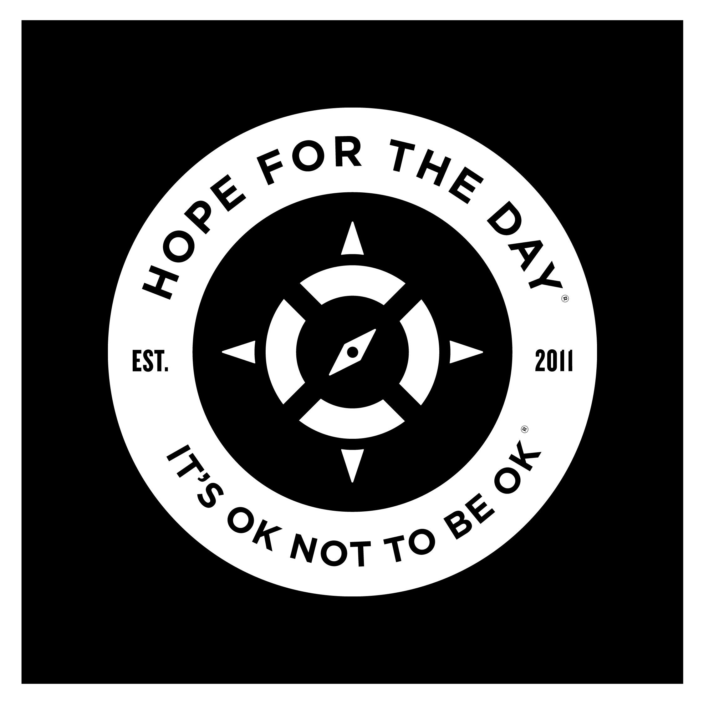


Slogan Mark and Trademark Use(®)
Slogan Mark
It's highly important that the word order is kept intact. "It's Ok" must always be seen before "Not To Be Ok". The preferred use is stacked with "It's Ok" on the top tier and the text center-aligned. This should appear in All Caps or Title Case when in use. Registered trademark Symbol must always follow “It’s Ok Not to Be Ok”.
What Not To Do with the Slogan Mark
Separate "It's Ok" from "Not to Be Ok."
Change the order of the stack
Omit words or punctuation
SPACING: A minimum of 30pt all around
Remove ® after “It’s Ok Not to Be Ok”

Registered Trademark
The registered trademark symbol, ®, is a typographic symbol that provides notice that the preceding word or symbol is a trademark or service mark that has been registered with a national trademark office.
Registered Trademark on Slogan Mark
The registered trademark symbol, ®, must be displayed after the last "K" in "IT'S OK NOT TO BE OK" where the top is aligned to the top of the cap-height. The center of the trademark symbol must be aligned to the left edge of the period that follows it. The trademark symbol must be approximately the same size as the period that follows it.
Brand Colors
Color palette branding is important because it’s a tangible component of your brand that people notice first and foremost. Color actually increases brand recognition up to 80 percent and is one of the biggest reason why consumers choose to buy from or engage with a brand. Colors also play a large role in how your brand’s personality is perceived.

In an effort to avoid triggering members of our community we use pink instead of red. Exceptions to this rule can be made on a case by case bases depending on the demographic we are reaching out to.
At Hope For The Day® (“HFTD”) we empower the conversation in proactive suicide prevention and mental health education. HFTD’s vision is to lead the global conversation on proactive prevention in order to create a cultural shift on how we support mental health in our communities. We provide this website at https://www.hftd.org/ to provide you with more information about those services (the “Website”). As a condition of using the Website, you must agree to these Terms of Use (the “Terms”), which are a legally binding contract between you and HFTD (hereinafter also referred to as “We” or “Us”), and that govern your use of the Website.
These Terms supersede and replace any prior terms or agreements concerning use of the Website. You accept these Terms through your use of the Website or by continuing to use the Website after being notified of a change to these Terms. In some cases, HFTD may ask you to affirmatively confirm your agreement to these Terms. Note that additional terms that are specific to a particular aspect of the Website may be set forth in connection with your use of a particular aspect of the Website, such as informed consent forms, if applicable, and such additional terms are hereby incorporated herein by reference.
THIS WEBSITE IS NOT DESIGNED OR INTENDED FOR USE IN EMERGENCY SITUATIONS. EMERGENCIES AND URGENT QUESTIONS SHOULD BE DIRECTED IMMEDIATELY TO QUALIFIED PROFESSIONALS. IF YOU OR SOMEONE ELSE REQUIRES EMERGENCY ASSISTANCE CALL 911 AND/OR VISIT AN URGENT CARE CENTER.